Joker UI kit Figma is a document in Figma that has a ready-to-use customizable set of styles and design of graphic elements for designing interfaces. It is essentially a design system without code or a template for creating a new design system. Joker UI kit helps to design a holistic design, saves time for designers and developers, speeds up design processes, facilitates communication between specialists, and allows you to work in one ecosystem. If you wondered how to use Figma UI kit, then after reading this article you will have no questions.
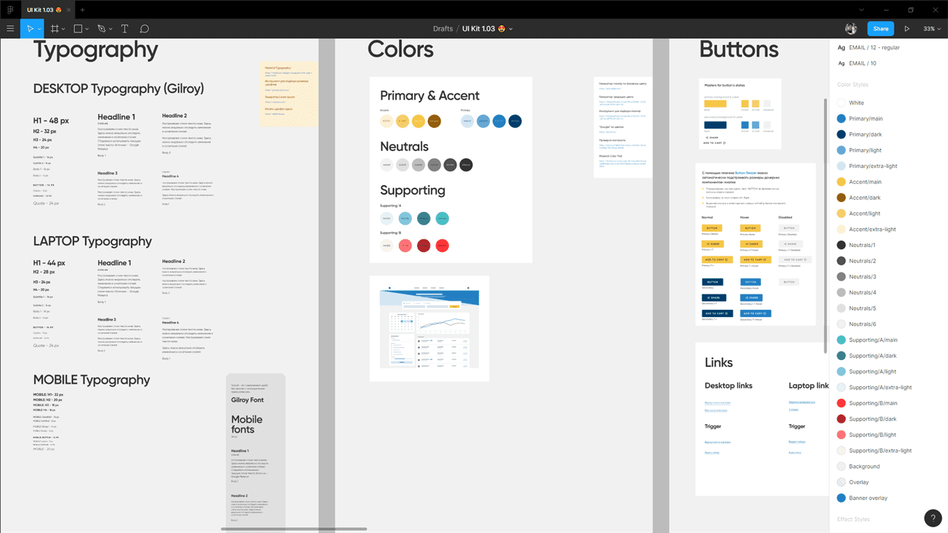
All elements are created according to the principle of atomic design and are arranged in such a way that anyone can easily and quickly find any necessary element. The development of the UI kit has been implemented according to the atomic principle with the help of components. During e-commerce website development, Figma is an indispensable tool for UX/UI design. The principles of 8 px grid are followed. All sizes are multiples of 8, some are multiples of 4.
UI kit layout is an interesting experience for our designers and a great tool for people who will actively use it. A sample joker kit can be found on our Behance.
How to Use a UI Kit in Figma?
Figma UI kit helps to design consistent design, saves time of designers and developers, speeds up design processes, facilitates communication between specialists, allows one to work in one "ecosystem". Moreover, Figma is a popular tool for material web design.
Using a UI kit for Figma can greatly simplify the life of designers 😀. The structure of the document is created - a kind of template for a quick start. You just need to adjust the style of the already created objects (fonts, colors, shape buttons, etc.) and all the elements and blocks will inherit this style. Or you can immediately build layouts of ready-made blocks, and then configure these blocks in one place (in the master components), and all copies (instances) will inherit the changes. The Figma is very useful in android development, using this tool it is possible to convert your idea into native Android apps quickly.
Layouts of the site, created with the UI kit will contain a clearly structured style guide, which can also be useful for marketers to create promotional materials, for developers - if you need some element which is not in the design. Figma is an effective tool for mobile development, this tool is used to create the design of a mobile application. Moreover, if one designer starts work and another continues, or several specialists work on a project simultaneously - there will be no confusion and duplicates in the layout. The clear design concept of Joker UI kit will help facilitate interface design, website prototyping, and UI design in general. With its intuitive design features and many features, Figma is the ideal tool for website development.
Philosophy of the "Joker UI Kit"
- The atomic approach;
- From the atom to the organism;
- 8 px grid;
- Consistent design;
- Team spirit.
What's Inside?
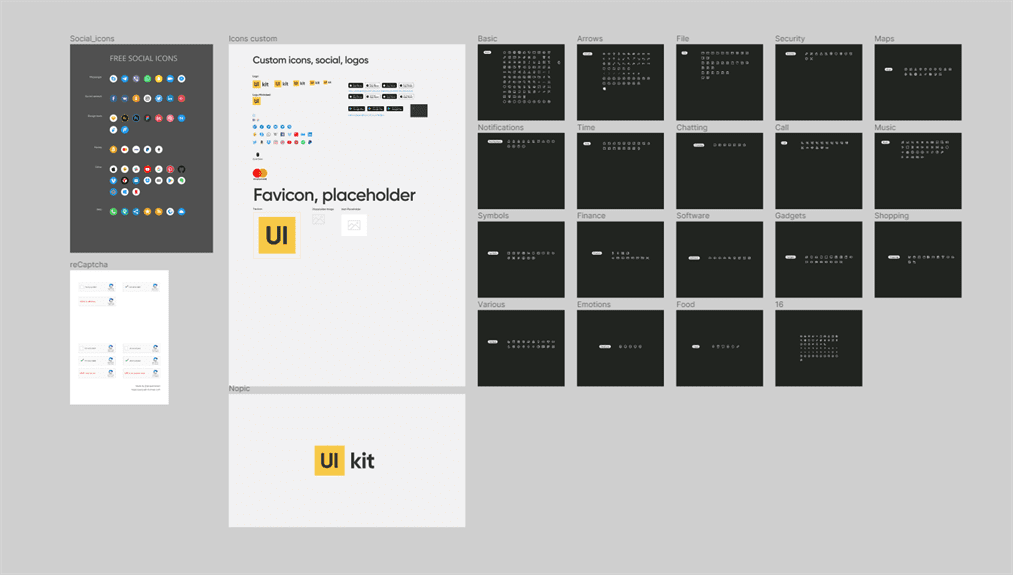
- Pack of quality icons for all occasions, all icons are created according to the guides and have a size of 24х24 px + additional icons for social networks, blanks to create Favicon, placeholder
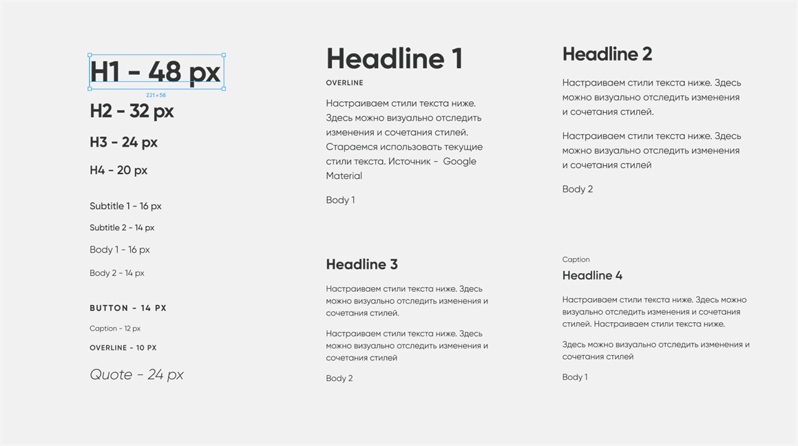
- A sophisticated font system for desktop, laptop, smartphone. The default font is Gilroy
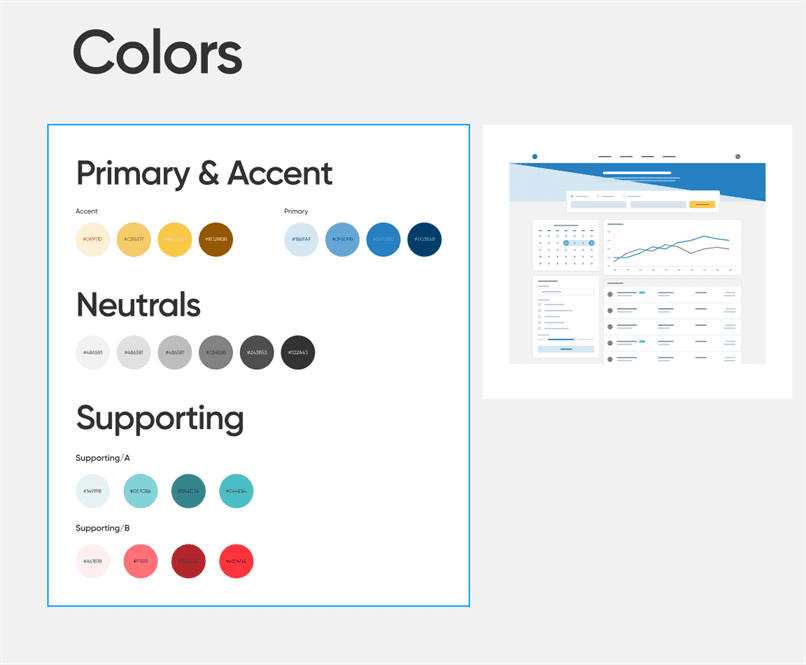
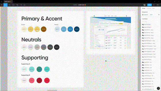
- A elaborate palette with division into functions (main color, accent color, neutral tones, auxiliary colors) with the ability to preview the overall picture
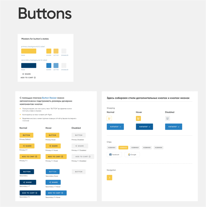
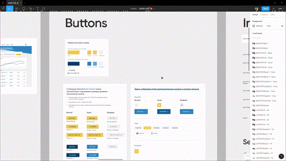
- A button system that allows you to quickly set up states (hover, focus, inactive), and switch between them
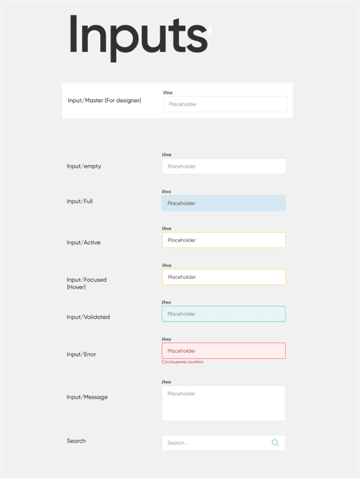
- System of instances with elaborate states. The overall view is set up through a single master component
- System of selects, dropdowns, checkboxes
- Components for fast creation of tables
- Many other elements, such as paginators, badges, and other
- Modal window templates
- Main page and menu templates, including adaptive
- Email templates for Email newsletters
- Color matching tools
- Mockups for presentations
- Grid presets for pages and blocks
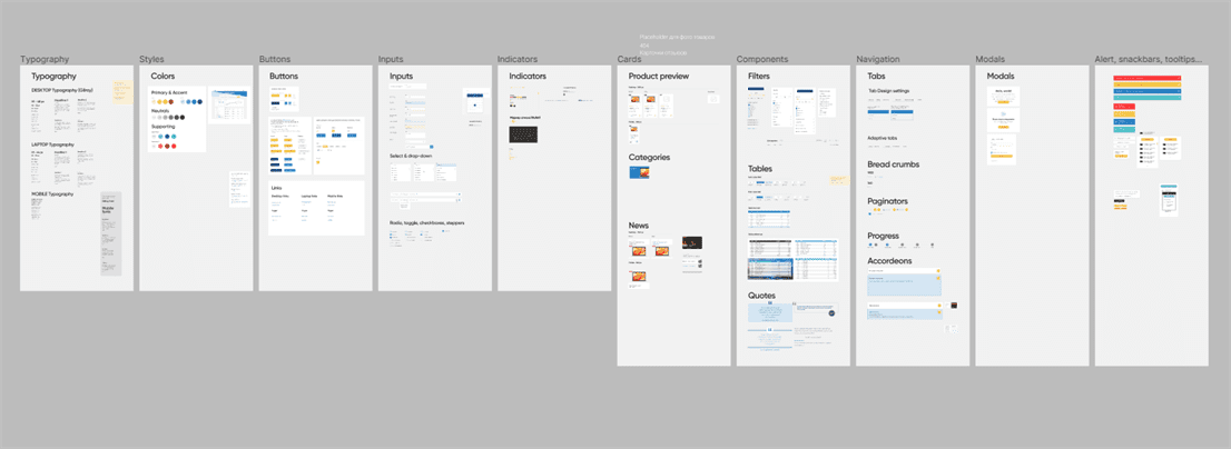

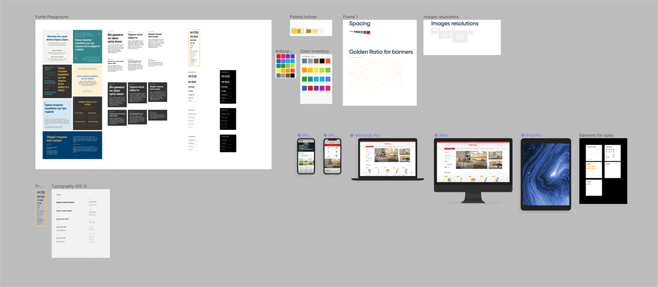
How to Work With it?
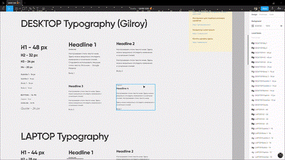
- In this section of the Figma joker review, we will describe how to work with this tool. We start with typography. We use ready-made styles. Configure each (this will take a little time at first, but later it will pay off + no one forbids the use of plugins, but that's another story). Modifiable styles dynamically change on previews.
- Set up the palette. Control the preview if necessary.
- Setting up the buttons, or rather the master components of the states.
- We set up the intuitions. Configure the form and content in the master components. Coloring other states with color styles.
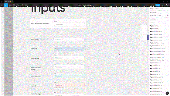
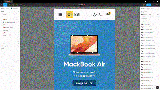
- Let's get to work 🙂. Use the component library. Do not draw new ones, stylize ready-made ones (not necessary yet, in the future, and if consciously - please).
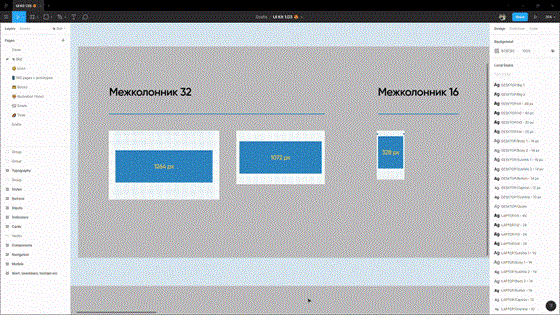
- We recommend using the grids from the UI kit.
What's Next?
Coders use UI kit in Figma to reduce the time and cost of designing websites, especially creating an online store, giving ready and flexible solutions for design and development teams. In the future, we plan to work on simplifying use, adding animated icons and blanks for animating micro interactions, and customizable illustrations.
Our experts decided to create UI kit in Figma to gain additional experience and useful knowledge. We also plan to turn this UI kit into a complete design system, with documentation and ready-programmed blocks.
Conclusion
The decision to create UI kit on Figma can facilitate many aspects of your project development and simplify the life of designers. Website design is a very responsible moment when developing a digital solution for a business. For example, an online store requires a serious approach to UX and UI design. It is important so that the customer can easily buy the necessary product, without unnecessary search tricks.
Similar articles
View allyour business
together
- PROJECT INQUIRIES info@artjoker.net
- CALL US +1 213 423 05 84
contact us:


